Tag Archives: shooting game

Project MSG – The Retro-Punk Experience

Last month I was able to reveal a little about the game project that I’ve been working on. Shares, retweets, favourites, +1’s and feedback via messages and email from many of you has been both positive and very encouraging – thank you!

It seems that the ‘Project MSG’ logo made a strong impact. The response that I received, while not entirely unexpected, was rather more enthusiastic than anticipated. While I do concur that it’s a cool looking logo. And as the creator of this logo I would like to add that I do so in a humble and non-boisterous manner. What matters is that you love it!

ProjectMSG_WhiteBackground
I should consider taking t-shirt orders 🙂

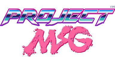
The logo has managed to convey and stir up strong nostalgic feelings of 8-bit & 16-bit gaming memories for you lot. As if the mid-80’s or even early 90’s were no longer some forgotten bygone era. I have no intention in ruining those feelings and you can all rest assured that the official logo will still retain this flavour.

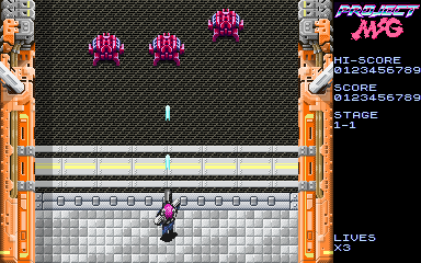
Fortunately, you didn’t just like the logo. There was a single screenshot of ‘stage 1-1’ of the game which managed to attain significant attention. Plus a fair amount in the twittersphere. Detailed pixel art graphics are gladly still welcome among retro game fans. This singular shot only gives a small glimpse of the game, but it’s enough to give a basic idea of the styling and gameplay.

Defining this project becomes easier as work progresses. While the initial brief described it as 2D shooting game with a cyberpunk theme. This is still true for the project today. However, newer aspects start to surface that were faintly observed in the initial stages of development.  Comparatively to, an alter ego of some kind, quietly hiding within the shadows of the dominant personality. Only to make itself known at a later date.

Perhaps it all boils down to the aesthetic choices. The clashing of pixel art and FM-synth generated music, while a natural fit gives out a far more raw electronic feel. Due to modern development techniques and increased processing power, we have become accustomed to games that are incredibly slick and shiny. Nothing wrong with this intrinsically. After all, I’m all for high production values and polish in the creation of video games. It’s just that this added fidelity often constitutes in a loss of a raw edge.

This rawness is ultimately part of the charm. It’s not just a retro-centric attribute that I’m pointing out here. It’s inherently punk in nature. Sticking out like a sore thumb, provoking the player that it’s nothing like those big-budget, overproduced but somehow sterile games. Project MSG wants to get dirty!


Project MSG – Early Development

This much delayed post was supposed to go up end of last month. Apologies for arriving late to the party but there were some business matters that required my attention. Now that I have more time available, blog updates will gradually normalize.

In this article I will focus exclusively on early development work done on Project MSG.  Anyone following this blog will already be aware that this project is a retro-style shooting game. Consisting of a cyberpunk theme and a 2D pixel art style with a top-down perspective.While this has intrigued some folks, no work in progress screens have been shown publicly – yet.

Today that will change. The very first shots will be revealed here, exclusively!

While I’ve mentioned this before, it bears repeating: Project MSG is a tentative title. The true name of the game will be revealed sometime before the actual release. Nevertheless I like setting the tone for the game, early on. I took the liberty of designing a logo even though it’s unlikely to find it’s way on to the Alpha.

The logo is shiny, futuristic with an obvious manga-esque influence – just how I like it. Expect the final logo to follow suit.

ProjectMSG_WorkingTitleScreen
Title screen used for internal development

Next in line is probably one of the most important screens. It’s something that players will not get to see but has been invaluable in developing the game. Making good use of display real estate was always going to be a top priority. Also taking into account the varying display sizes, resolutions and aspect ratios that both PC’s and iOS devices come with – this is a tricky proposition.

To retain an authentic retro/pixel art style it was glaringly obvious that the native resolution we should work with must be low. Ideally the resolution we were initially targeting was 320 x 240 pixels which was pretty much the standard for most 16-bit games. However, due to the prevalence of widescreen displays on the PC front that would cause some issues. As a resolution of 320 x 240 has an aspect ratio of 4:3 and the majority of widescreen displays are 16:9 with a few at 16:10.

In order to counter this problem some experimentation was needed, and an elegant solution to be found. Since the majority, if not all the tiles in the game would be at 16 x 16 pixels I decided that the play area had to conform to this. The integrity of the tiles were to be tested on a variety of display setups from crt monitors through to flat screen monitors and televisions. Last but not least, on iOS devices. 

The following screen was created to quickly and efficiently test this out. Our new ideal resolution was also discovered. Almost identical to Capcom’s CP System arcade boards (384 x 224) we went with a native resolution of 384 x 240 pixels. Through extensive testing we found that it works very well with a large variety of displays and aspect ratios, while still giving us a little extra space to work with. We reserved this area for the hud.

ProjectMSG_Prototype01_24Aug2014
Testing….testing

After we had that out of the way, it was time to start putting together our prototype. It wasn’t important to make anything fancy, just something that could be done rapidly but still be fun. An important choice that had to be made was whether to take the bullet hell route or go traditional. While I love bullet hell shmups and own a great deal of them, for a debut release I thought it would be best to go as old skool as possible.

The emphasis was now on enemy formations and less about filling the screen with bullets. It was also vital to ensure that the odds were clearly stacked against the player. While a 2-player option was seriously considered, single player was favoured to capture that more desperate hardcore climate. And also to give the player a strong sense of accomplishment once a stage is cleared.

ProjectMSG_Prototype02_24Aug2014
Prototyping the cyborg shooting action!

Certainly, the prototype is not exactly great looking. It may exude some minimalist style but not even close to the desired art direction. I’ve always been a fan of detailed, crisp and colourful graphics. It would only be natural for me to push my pixels in that direction. Considering that our main character is a cyborg – and in turn the setting would take a techno-fetishistic tone.

It didn’t take too long for those tile maps to start taking form. Soon enough the backgrounds for the first stage were done and put in place. Time to animate our hero sprite and populate the screen with some proper enemies.

ProjectMSG_Stage1_1_24Aug2014
Shoot you before you shoot me 😛

As you’re reading this, development continues on this project. There will be more updates in the near future to keep you posted on how things are coming along. Till next time!


Looking Good

Nowadays we tend to refer to software as app(s) or application(s). Ditto for games or game software. Since I like to keep things retro, I will stick to software since it’s always been a perfectly good description.

My first home computer was an 8-bit microcomputer known as the Sinclair ZX Spectrum 48K. Yes, back in the early to mid 80’s computers would often be called micros or microcomputers. Later on PC or personal computer became the more popular term due to the rise of the IBM PC and compatible variants in the market.

The ZX Spectrum was a great little machine but rather primitive, especially by today’s standards. Nevertheless it’s renowned for it’s huge game library with some timeless classics. But I’m not writing this post to reminiscence about any specific games for this computer. Instead I’m writing this to point out the care that publishers took at packaging their software. Particularly the sleeve artwork.

GreenBeret_ZXSpectrum
The starts were aligned…the badass sleeve art represented the actual game very well

Most of the software on the ZX Spectrum came on cassette tape, it was a cost-effective method that ensured that original games were cheap at retail. In many cases only a tenth of the price of a diskette based game for the PC or any of the 16-bit computers gradually appearing, during that period. It was not surprising the Spectrum was extremely popular among teenage boys who had only very limited pocket money to spend on games.

Publishers were well aware of this and were smart when commissioning artwork that would make it’s way on the cover of each game. Arcade ports were massively popular back in those days. Such action-heavy titles required artwork that would fit the bill. Fortunately, the quality of artwork was of a very high standard. Very little or no computer graphics were used.

Yes, those are airbrushed breasts…don’t fap

While awesome game cover art is still produced these days. I feel there is an over-reliance on CG-art and game logos are becoming bland, boring even. The examples shown here, both are stunningly illustrated with insanely cool logos. Compare these fine covers to most of the current gen games sitting on stores shelves and you will see the difference.