Nowadays we tend to refer to software as app(s) or application(s). Ditto for games or game software. Since I like to keep things retro, I will stick to software since it’s always been a perfectly good description.
My first home computer was an 8-bit microcomputer known as the Sinclair ZX Spectrum 48K. Yes, back in the early to mid 80’s computers would often be called micros or microcomputers. Later on PC or personal computer became the more popular term due to the rise of the IBM PC and compatible variants in the market.
The ZX Spectrum was a great little machine but rather primitive, especially by today’s standards. Nevertheless it’s renowned for it’s huge game library with some timeless classics. But I’m not writing this post to reminiscence about any specific games for this computer. Instead I’m writing this to point out the care that publishers took at packaging their software. Particularly the sleeve artwork.
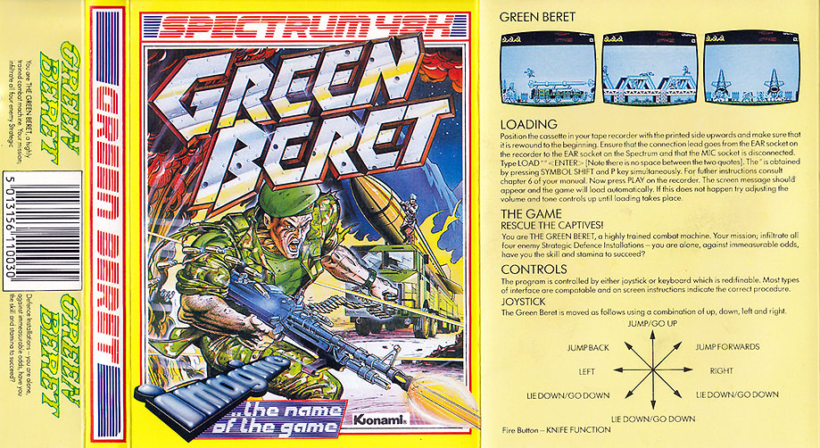
Most of the software on the ZX Spectrum came on cassette tape, it was a cost-effective method that ensured that original games were cheap at retail. In many cases only a tenth of the price of a diskette based game for the PC or any of the 16-bit computers gradually appearing, during that period. It was not surprising the Spectrum was extremely popular among teenage boys who had only very limited pocket money to spend on games.
Publishers were well aware of this and were smart when commissioning artwork that would make it’s way on the cover of each game. Arcade ports were massively popular back in those days. Such action-heavy titles required artwork that would fit the bill. Fortunately, the quality of artwork was of a very high standard. Very little or no computer graphics were used.
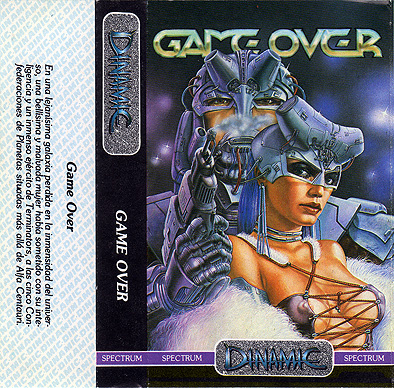
While awesome game cover art is still produced these days. I feel there is an over-reliance on CG-art and game logos are becoming bland, boring even. The examples shown here, both are stunningly illustrated with insanely cool logos. Compare these fine covers to most of the current gen games sitting on stores shelves and you will see the difference.

Old computer game box art is generally better than the modern equivalent. Silpheed, Thexder, the early Ultima games… There’s nothing quite like a good painting to forcefully represent a game’s basic premise. We need a return to the old box art ways; perhaps the indie scene could revive that habit.
I completely agree with you, Kevin. The games you mention all had amazing box art and I remember them well.
Since indie developers are making a lot of retro-style games it would make sense to revive that old school art.