Tag Archives: pixel art

Agent Smith Receives The 16-BIT Shock Treatment

Recently a fellow on twitter known as Dodekatheoi (we’re following each other) requested a pixel-art icon from me for his various social media and gaming accounts. In particular he wanted those icons to represent the infamous antagonist of the Matrix trilogy – Agent Smith. He also required that these icons be at screen dimensions of 100 x 100 and later on at 400 x 400. An intriguing prospect to say the least, which I was happy to dive into.

The Matrix movies are fairly stark visually, this works particulalry well in context. Everyone should have an idea of what these movies are about with their rather pessimistic, cyberpunk flavour. Mostly monotone colour hues are used throughout the trilogy, painting a grim alternate reality. Fortunately, pixel-art with it’s reliance on limited colour palettes is a perfect fit for such renditions in low-rez. Capturing the very essence of what Agent Smith is about would be a key goal. I, therefore opted to work directly from a still image from the movie which perfectly depicted this.

pixel,Pixel,PIXEL,art,Art,ART,agent,Agent,AGENT,smith,Smith,SMITH,the,The,THE,matrix,Matrix,MATRIX,cyber,Cyber,CYBER,punk,Punk,PUNK,90,90s,90's,'99,99,1999,neo,Neo,NEO,red,Red,RED,blue,Blue,BLUE,pill,Pill,PILL,science,Science,SCIENCE,fiction,Fiction,FICTION,movie,Movie,MOVIE,movies,Movies,MOVIES,16-BIT,Shock,SHOCK,shock,demos,Demos,DEMOS,antypas,Antypas,ANTYPAS,artist,Artist,ARTIST,game,Game,GAME,dev,Dev,DEV,developer,Developer,DEVELOPER,edit,Edit,EDIT,indie,Indie,INDIE,1bit,1-bit,1 bit,1Bit,1BIT,1-BIT,1 BIT,wacom,Wacom,WACOM,Intuos,intuos,INTUOS,digital,Digital,DIGITAL,palette,Palette,PALETTE,color,Color,COLOR,colors,Colors,COLORS,colour,Colour,COLOUR,colours,Colours,COLOURS,retro,Retro,RETRO,gaming,Gaming,GAMING,
Agent Smith as originally depicted in video form (left) to a pixel art icon (right)

At first glance, it would seem that by merely dithering the image the desired result would be produced. However, this is not the case as dithering such a low-quality image only produces a terrible, uneven pixel texture. Images like these, typically found with a google search and of standard definition video quality are overwrought with screen artifacts. At best, this image would only result in a cheap, dirty digitized look and not that of carefully crafted pixel art.

Nevertheless, the image was not completely useless – after all the depiction of Agent Smith was ideal. I decided to apply a hard contrast and then mask the image, giving me a good trace of the character. The mask was then layered in a new image to work on at a screen resolution of 100 x 100 pixels. After this I proceeded to clean up the image, getting rid of some nasty, rough edges and those odd pixels that were just at the wrong place.

Next came one of the most important steps in putting together a colour palette that would do the image justice. I decided to work in 8-bits per pixel from the get-go and narrowed the palette down to 12 colours. Initially when I started allocating colours and testing them out, I was already up to 20 colours but quickly ascertained that that’s too much. I gradually got rid of the unneccessary colours, keeping only those that worked best with the others within the palette.

I always keep a Wacom Intuos tablet handy for drawing purposes even though I’m proficient with a mouse. For pixel-art I feel the mouse is often the better choice but there are certain aspects that a pen and tablet handle better. In respect, to drawing organic imagery a pen and tablet beats out the mouse more often than not. Ditto for shading purposes, I’ve found there is a greater speed advantage with the Intuos. And in the case of the Agent Smith icon, the tablet came in as an indispensible tool.

pixel,Pixel,PIXEL,art,Art,ART,agent,Agent,AGENT,smith,Smith,SMITH,the,The,THE,matrix,Matrix,MATRIX,cyber,Cyber,CYBER,punk,Punk,PUNK,90,90s,90's,'99,99,1999,neo,Neo,NEO,red,Red,RED,blue,Blue,BLUE,pill,Pill,PILL,science,Science,SCIENCE,fiction,Fiction,FICTION,movie,Movie,MOVIE,movies,Movies,MOVIES,16-BIT,Shock,SHOCK,shock,demos,Demos,DEMOS,antypas,Antypas,ANTYPAS,artist,Artist,ARTIST,game,Game,GAME,dev,Dev,DEV,developer,Developer,DEVELOPER,edit,Edit,EDIT,indie,Indie,INDIE,1bit,1-bit,1 bit,1Bit,1BIT,1-BIT,1 BIT,wacom,Wacom,WACOM,Intuos,intuos,INTUOS,digital,Digital,DIGITAL,palette,Palette,PALETTE,color,Color,COLOR,colors,Colors,COLORS,colour,Colour,COLOUR,colours,Colours,COLOURS,retro,Retro,RETRO,gaming,Gaming,GAMING,
Pixel Edit of Agent Smith from 8-bit right down to 1-bit colour mode

The process from here on was a matter of working on those dots diligently, for a small image size such as this I seldom use more than 3 layers. Once the image looks satisfactory, it’s time for some minor colour balancing. Finally the image is complete and we have ourselves a nice rendition of Agent Smith with only 12 colours. I decided to further reduce the colour down to 8 colours on a secondary image and then down to 1-bit colour depth which comprises of only 2 colours.

Generally the process as a whole is not terribly complex, nor is it the only way to go about doing this. But I believe this one of the more efficient methods for pixel pushers. In my next pixel art article I will reveal some similar work I’ve done on Raiden, the main protagonist from Metal Gear Rising: Revengeance.
Advertisement

Project MSG – Early Development

This much delayed post was supposed to go up end of last month. Apologies for arriving late to the party but there were some business matters that required my attention. Now that I have more time available, blog updates will gradually normalize.

In this article I will focus exclusively on early development work done on Project MSG.  Anyone following this blog will already be aware that this project is a retro-style shooting game. Consisting of a cyberpunk theme and a 2D pixel art style with a top-down perspective.While this has intrigued some folks, no work in progress screens have been shown publicly – yet.

Today that will change. The very first shots will be revealed here, exclusively!

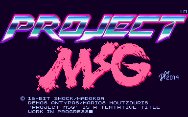
While I’ve mentioned this before, it bears repeating: Project MSG is a tentative title. The true name of the game will be revealed sometime before the actual release. Nevertheless I like setting the tone for the game, early on. I took the liberty of designing a logo even though it’s unlikely to find it’s way on to the Alpha.

The logo is shiny, futuristic with an obvious manga-esque influence – just how I like it. Expect the final logo to follow suit.

ProjectMSG_WorkingTitleScreen
Title screen used for internal development

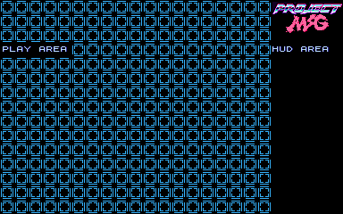
Next in line is probably one of the most important screens. It’s something that players will not get to see but has been invaluable in developing the game. Making good use of display real estate was always going to be a top priority. Also taking into account the varying display sizes, resolutions and aspect ratios that both PC’s and iOS devices come with – this is a tricky proposition.

To retain an authentic retro/pixel art style it was glaringly obvious that the native resolution we should work with must be low. Ideally the resolution we were initially targeting was 320 x 240 pixels which was pretty much the standard for most 16-bit games. However, due to the prevalence of widescreen displays on the PC front that would cause some issues. As a resolution of 320 x 240 has an aspect ratio of 4:3 and the majority of widescreen displays are 16:9 with a few at 16:10.

In order to counter this problem some experimentation was needed, and an elegant solution to be found. Since the majority, if not all the tiles in the game would be at 16 x 16 pixels I decided that the play area had to conform to this. The integrity of the tiles were to be tested on a variety of display setups from crt monitors through to flat screen monitors and televisions. Last but not least, on iOS devices. 

The following screen was created to quickly and efficiently test this out. Our new ideal resolution was also discovered. Almost identical to Capcom’s CP System arcade boards (384 x 224) we went with a native resolution of 384 x 240 pixels. Through extensive testing we found that it works very well with a large variety of displays and aspect ratios, while still giving us a little extra space to work with. We reserved this area for the hud.

ProjectMSG_Prototype01_24Aug2014
Testing….testing

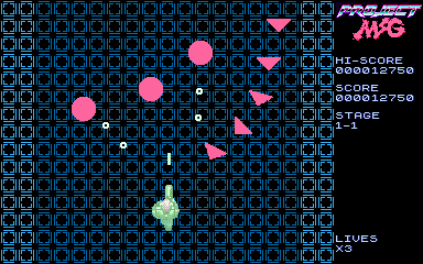
After we had that out of the way, it was time to start putting together our prototype. It wasn’t important to make anything fancy, just something that could be done rapidly but still be fun. An important choice that had to be made was whether to take the bullet hell route or go traditional. While I love bullet hell shmups and own a great deal of them, for a debut release I thought it would be best to go as old skool as possible.

The emphasis was now on enemy formations and less about filling the screen with bullets. It was also vital to ensure that the odds were clearly stacked against the player. While a 2-player option was seriously considered, single player was favoured to capture that more desperate hardcore climate. And also to give the player a strong sense of accomplishment once a stage is cleared.

ProjectMSG_Prototype02_24Aug2014
Prototyping the cyborg shooting action!

Certainly, the prototype is not exactly great looking. It may exude some minimalist style but not even close to the desired art direction. I’ve always been a fan of detailed, crisp and colourful graphics. It would only be natural for me to push my pixels in that direction. Considering that our main character is a cyborg – and in turn the setting would take a techno-fetishistic tone.

It didn’t take too long for those tile maps to start taking form. Soon enough the backgrounds for the first stage were done and put in place. Time to animate our hero sprite and populate the screen with some proper enemies.

ProjectMSG_Stage1_1_24Aug2014
Shoot you before you shoot me 😛

As you’re reading this, development continues on this project. There will be more updates in the near future to keep you posted on how things are coming along. Till next time!